Why Posters Are More Than Just Art: A Deep Dive

TL; DR
Posters have played an important role in everything from social movements to modern brand marketing.
Their history goes beyond advertising: They have supported social movements, promoted films, and communicated important messages across different periods and cultures.
Great poster art is built on strong design foundations: Elements such as visual hierarchy, typography, and colour help create posters that are both engaging and easy to understand.
Posters continue to play a role today: From marketing campaigns to digital content, posters remain a powerful way to capture attention and share ideas.
Table of Contents
What Is Poster Art?
Poster art is a form of visual communication that combines imagery, typography, and layout to catch attention and share a message.
Posters are a part of everyday visual culture. They promote films, concerts, fashion campaigns, products, exhibitions, and social causes. Some are printed and glued onto walls, while others live online as digital-native posters with their own set of size and motion considerations.
What makes poster design special is its immediacy. A well-designed poster can communicate its message before the viewer consciously processes all the details.
To achieve this, designers balance colour, composition, typography, and imagery to create visuals that feel memorable, emotional, or exciting. While styles continue to evolve, the goal stays the same: stop attention, communicate clearly, and leave a lasting impression.
History of Posters
Posters have a much longer history than most people expect. What started as simple public notices grew into one of the most recognisable forms of visual art and advertising.
As printing technology improved, posters changed with it. Different eras brought different styles, colours, and ideas — each reflecting the culture of its time.
Early Posters and The Birth of Print
Before printed posters existed, people painted announcements directly onto walls in public spaces. Early printed posters started appearing in Europe during the late 1400s after the printing press spread across the continent. At first, these posters were simple and practical. They announced events, sales, and public information.
Things changed during the Industrial Revolution. Cities became busier, businesses grew faster, and people needed new ways to communicate with large crowds. Thanks to lithography printing, posters could suddenly include colour, illustration, and decorative typography. During the late 1800s to the early 1900s, artists used posters to promote art movements and spread wartime propaganda.
That was the moment posters started becoming art.
Poster Design Evolution by Era
Era | Date Range | Characteristics | Common Uses | Visual Style |
Art Nouveau | 1890-1920 | Decorative lines and elegant illustrations | Advertising and theatre | Soft and detailed |
Bauhaus & Modernism | 1919-1933 | Simple layouts and bold typography | Public campaigns and posters | Clean and minimal |
Pop Art | 1950s-1970s | Bright colours and pop culture references | Music, film, and advertising | Bold and playful |
Postmodernism | 1980s-1990s | Experimental layouts and mixed styles | Film posters and branding | Expressive and layered |
Digital Era | 2000s-Present | Digital tools and mixed media | Marketing and social media | Fast-moving and versatile |
Art Nouveau (1890s to 1920s)

Art Nouveau is the era where poster design crossed into fine art. Artists embraced organic lines, nature-inspired details, and rich colour gradients to create decorative compositions. Artists such as Alphonse Mucha became known for highly decorative poster designs, including his commissions for actress Sarah Bernhardt. Works such as Gismonda and La Dame aux Camélias helped define the Art Nouveau style and demonstrated how posters could function as both commercial design and artistic expression.
The hallmarks of the style — decorative typography, flowing forms, and ornate detail — are still showing up in design references today.
Modernism and Bauhaus (1920s to 1940s)

Modernism introduced a different approach to poster design. While Art Nouveau embraced decorative details, the Bauhaus movement focused on clarity, function, and simplicity. Designers used geometric shapes, bold typography, and structured layouts to communicate messages more effectively.
Although the Bauhaus school operated from 1919 to 1933, its influence continued well beyond its closure. During wartime, designers applied many of the same principles to create posters with clear messaging, strong contrast, and visuals that people could understand at a glance.
Mid-Century and Pop Art (1950s to 1970s)

After the war, poster design became colourful again. Posters from this period felt energetic, optimistic, and full of personality.
Then came Pop Art. Posters became louder, brighter, and heavily inspired by celebrity culture, music, and advertising. Artists used bold colours, comic-style visuals, and playful imagery that felt impossible to ignore. Many film and music posters from this era are still famous today because they captured the feeling of their generation.
Late 20th Century and Postmodernism (1980s to 1990s)

Poster design continued to evolve throughout the late 20th century. Earlier designers, such as Saul Bass, popularised a more symbolic approach to film posters through shapes, colour, and visual storytelling. He was also known for his title sequence work in films such as Vertigo, Psycho, and Anatomy of a Murder.
By the 1980s and 1990s, designers embraced experimentation. Fragmented layouts, mixed visual styles, and unconventional typography became more common, while designers such as David Carson became known for grunge-inspired typography that challenged traditional design conventions.
Digital and Contemporary (2000s to Present)

Technology changed the way many designs create and distribute posters today. Digital design software expanded the ways designers create and refine poster designs. Tools such as Adobe Photoshop and Illustrator support detailed image editing and vector-based design work, while Canva made template-based design more accessible. On the illustration side, Procreate became a popular choice for sketching and digital artwork on the iPad.
Posters also moved beyond physical walls. Many designs are now created for phone screens, websites, social media campaigns, and digital billboards. At the same time, people are becoming more aware of sustainability in print design. More designers are exploring eco-friendly materials and printing methods as part of the creative process.
Poster storytelling also appears in other creative industries today. Many of the same ideas can be seen in entertainment and concept art.
Poster Design Principles
Visual Hierarchy in Posters
Visual hierarchy is the practice of arranging elements so the viewer's eye moves through them in order of importance. In poster design, it helps viewers quickly identify the main message, supporting details, and call to action.
Repetition, size, colour and contrast can guide the eyes to the most important element first. For example, a concert poster may use a large central image to capture attention before leading viewers to the artist's name, event title, and supporting details.
Example of a poster made with visual hierarchy in mind:
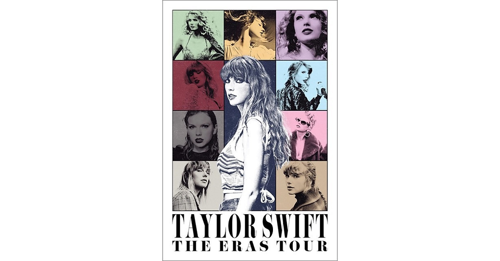
The Taylor Swift: The Eras Tour poster uses visual hierarchy to guide the viewer's attention. The large central portrait draws the eye first, while the surrounding images reinforce the concept of different musical eras. The artist's name and tour title anchor the design, making the key information easy to identify at a glance.
Typography Rules for Designers
The main purpose of typography is for legibility, communication, and engagement. It should be easy to read while maintaining visual appeal and correlation to the message sent.
Hierarchy still applies to typography, so it should be considered alongside other basic rules of poster design like appropriate colours, size and letter spacing, and not using more than three fonts at a time. Rules like these are in place to avoid the clashing of imagery, which can overwhelm or confuse audiences.
Here are the core poster design tips to keep in mind for type:
Cap your fonts at three
Build clear size contrast between your headline, subhead, and body text
Give your letters room
Match the font to the mood
Applying Colour Theory in Poster Art
While not limited to design, this theory demonstrates the different ways colours interact with each other. For example, how certain blues look more vibrant against one hue but pale against another or the ways colours can evoke emotions unique to certain combinations. If you were to create a poster about royalty, the associated colour scheme would be specific shades of purple.
Complementary palettes create contrast, analogous palettes build harmony, and triadic schemes create balance with variety. If you’re a visual learner, here’s another instance of colour theory in posters:

Colour and typography decisions don't stop at posters. See how the same principles shape album cover design: 5 Visually Distinct Album Covers Art: Part One
When designing posters, inspiration is part of the process, along with execution, iteration, and stakeholders' feedback. Designers often utilise mood boards, deal with client feedback, need many rounds of revisions, and must adhere to deadlines.
This is where TESSR comes into play. Designers often juggle multiple projects, feedback rounds, and deadlines at the same time. With features such as My Work, TESSR helps teams organise tasks, track progress, and manage workloads in one place, allowing designers to spend less time switching between tools and more time focusing on their work.
TESSR also has a helpful feature for both creative leaders and team members, Insights. This feature allows members to start building self-management skills by showing all progress, assigned work, and capacity. As for leaders, Insights supports healthy people management through transparent updates and reports.
Key Takeaways
From vintage theatre prints to modern digital campaigns, posters continue to grow alongside culture, technology, and creativity itself. Every era brings new styles, tools, and trends, but the excitement of turning an idea into something visual never disappears; that is what keeps designers coming back.
Whether you are designing for a film, a brand, a music event, or even a personal project, understanding poster art evolution gives you inspiration to build from.
Frequently Asked Questions (FAQs)
What makes a good poster design?
A good poster design communicates a single, clear message fast. That means strong visual hierarchy, a limited colour palette, type that is easy to read at a distance, and nothing on the page that does not earn its place. When every element — image, colour, typography — works toward the same message, the poster lands. When they compete, it falls apart.
What are the basic poster design principles every designer should know?
The core poster design principles are visual hierarchy, typography, and colour theory.
Visual hierarchy tells your viewer what to look at first.
Typography carries the tone and ensures legibility.
Colour theory shapes the emotion before anyone reads a word.
How many fonts should a poster use?
Stick to three fonts at most. Each typeface you add creates another voice competing for attention. A headline font, a supporting font, and one accent, if needed, are enough. More than that, the design starts to fight itself. This is one of the most consistent poster design tips across every era, from Bauhaus to today.
Author Bio
The TESSR Editorial Team is a collective of creatives and project management practitioners who enjoy sharing real-life experience on project management, creative workflows, and well-being in the creative industries. The team wants to help creative leaders, project managers, and individuals in animation, design, and creative studios understand the benefits of project management. So, creatives can all create with more freedom and, together, build a more sustainable creative culture.
Check out their LinkedIn page here.

Comments